Kamera Lensi Seçmenin İncelikleri
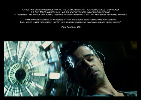 Optics have been an obsession with me. The characteristics of the original lenses – specifically the C&E series anamorphics – and the way they render images from contrast to their slight aberration whith flares: they have a certain personality that has never been recreated in optics. Anamorphic lenses have an incredible history and linage in motion picture photography. Each set of lenses throughout history have rendered different emotional results on the screen.
– Paul Cameron ASC
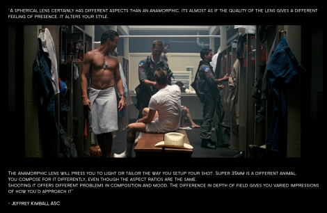 A spherical lens certainly has different aspects than an anamorphic. It’s almost as if the quality of the lens gives a different feeling or presence. It alters your style. The anamorphic lens will press you to light or tailor the way you setup your shot. Super 35mm is a different animal. You compose for it differently, even though the aspect ratios are the same. Shooting it offers different problems in composition and mood. The difference in depth of field gives you varied impressions of how you’d approach it.
– Jeffrey Kimball ASC
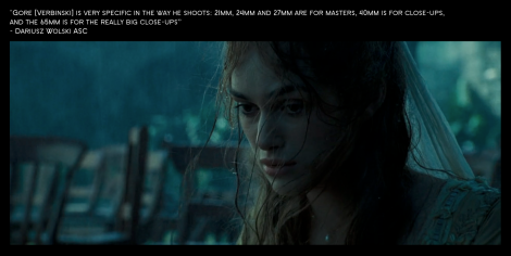 Gore Verbinski is very specific in the way he shoots: 21mm, 24mm and 27mm are for masters, 40mm is for close ups and the 65mm is for the really big close-ups.
– Dariusz Wolski ASC
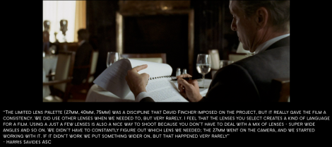 The limited lens pallette (27mm, 40mm, 75mm) was a discipline that David Fincher imposed on the project. But it really gave the film a consistency. We did use other lenses when we needed to, but very rarely. I feel that the lenses you select create a kind of language for the film. Using just a few lenses is also a nice way to shoot because you don’t have to deal with a mix of lenses – super wide angles and so on. We didn’t have to constantly figure out which lenses we needed: The 27mm went on the camera, and we started working with it. If it didn’t work we’d put something wider on, but that happened very rarely.
– Harris Savides ASC
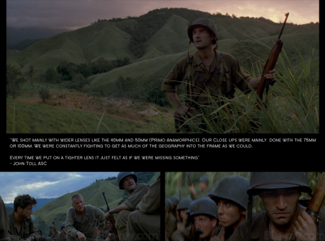 We shot mainly with wider lenses like the 40mm and 50mm (Primo Anamorphic). Our close ups were mainly done with the 75mm or 100mm. We were constantly fighting to get as much of the geography into the frame as we could. Every time we put on a tighter lens it just felts as if we were missing something.
– John Toll ASC
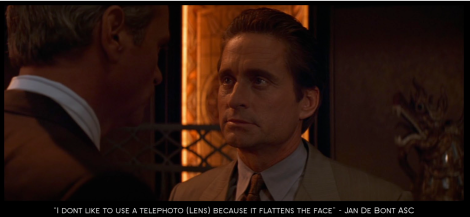 I don’t like to use a telephoto lens because it flattens the face
– Jan De Bont ASC
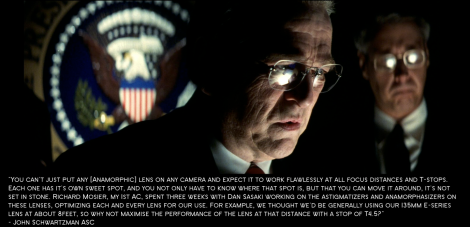 You can’t just put any (anamorphic) lens on any camera and expect it to work flawlessly at all focus distances and T-stops. Each one has its own sweet spot, and you not only have to know where that spot is, but that you can move it around, it’s not set in stone. Richard Mosier, my 1st AC, spent three weeks with Dan Sasaki working on the astygmatizer for the lenses, optimising each and every lens for our use. For example, we thought we be generally using our 135mm E– Series lens at about 8 feet, so why not maximise the performance of the lens at that distance with a stop of T.4.5?
– John Shwartzman ASC
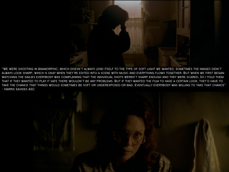 We were shooting in anamorphic, which doesn’t always lend itself to the type of soft light we wanted. Sometimes the image didn’t always look sharp, which is okay when they’re edited into a scene with music and everything flows together. But when we first began watching the dailies everybody was complaining that individual shots weren’t sharp enough and they were scared. So I told them that if they wanted to play it safe there wouldn’t be any problem. But if they wanted the film to have a certain look, they’d have to take the chance that things would sometimes be softer or underexposed or bad. Eventually everybody was willing to take that chance.
– Harris Savides ASC
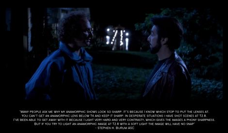 Many people ask me why my anamorphic show look so sharp. It’s because I know which stop to put the lens at. You can’t get an anamorphic lens below T4 and keep it sharp. In desperate situations I have shot scenes at T2 .8. I’ve been able to get away with it because I light it very hard and very contrasty, which gives the image of phony sharpness. But if you try to light an anamorphic image at T2 .8 with a soft light the image will have no snap.
– Stephen H. Burum ASC
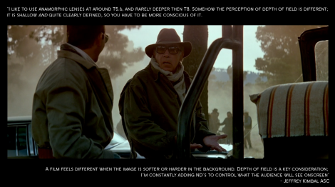 I like to use anamorphic lenses around T5.6, and rarely deeper than T8. Somehow the perception of the depth of field is different. It is shallow and quite clearly defined, so you have to be more conscious of it. A film feels different when the image is softer or harder in the background. Depth of field is a key consideration. I’m constantly adding NDs to control what the audience will see onscreen.
– Jeffrey Kimball ASC
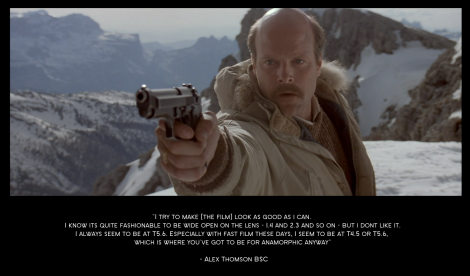 I try to make the film look as good as I can. I know it’s quite fashionable to be wide open on the lens – 1.4 and 2.3 and so on – but I don’t like it. I always seem to be at T5 .6. Especially with fast film these days, I seem to be at T4.5 or T5.6. Which is where you’ve got to be for an anamorphic anyway.
– Alex Thomson BSC
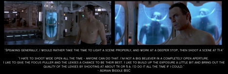 Speaking generally, I would rather take the time to light the scene properly, and work at a deeper stop than shoot the scene at T1.4. I hate to shoot wide open all the time – anyone can do that. I am not a big believer in a completely open aperture. I like to give the focus puller and the lenses a chance to be their best. I like to build up the exposure a little bit and bring out the quality of the lenses by shooting at about T 4 or T5.6. I’d do it all the time if I could.
– Adrian Biddle ASC
On Filters
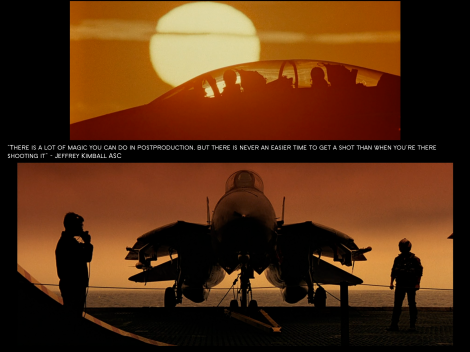 There is a lot of magic you can do in postproduction but there is never an easier time to get a shot than when you’re there shooting it.
– Jeffrey Kimball ASC
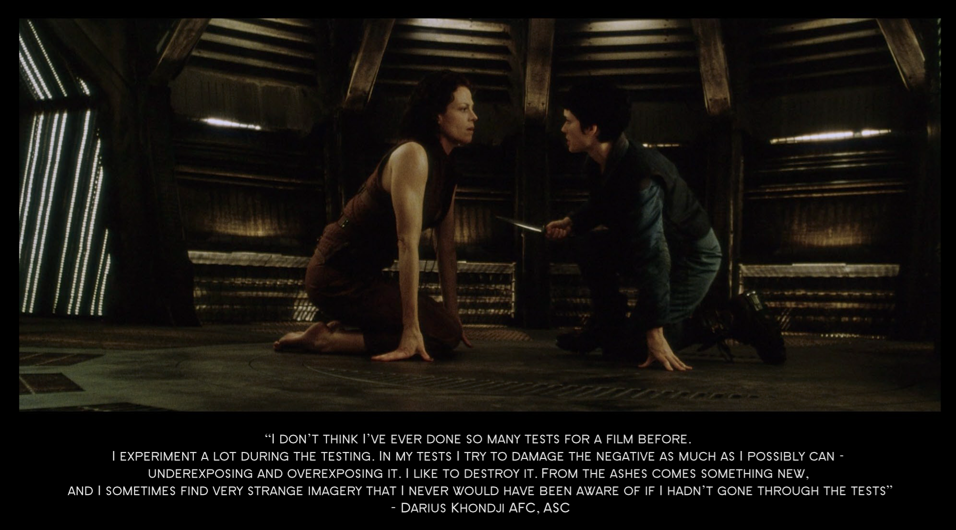
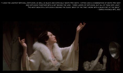 I used the lightest Mitchell diffusion, as well as black and especially white pro-mist. I often used a combination of white pro-mist and diffusion together with a net behind the lens – three layers of diffusion. But all of them very light. The most beautiful diffusion is behind the glass. Most of the time I work with the black net at the back.
– Darius Khondji AFC, ASC
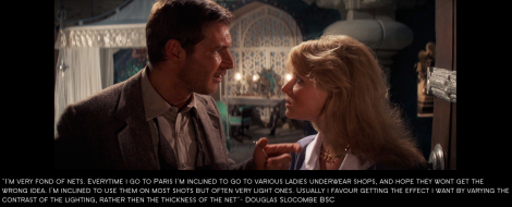 I’m very fond of nets. Everytime I go to Paris I’m inclined to go to various ladies underwear shops, and hope they won’t get the wrong idea. I’m inclined to use them on most shots but often very light ones. Usually I favour getting the effect I want by varying the contrast of the lighting, rather than the thickness of the net.
– Douglas Slocombe BSC
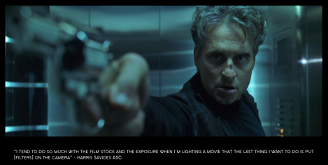 I tend to do so much with the film stock and the exposure when I’m lighting a movie that the last thing I want to do is put filters on the camera
– Harris Savides ASC
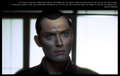 I’ve used a Dior net stretched across the frame on just about everything I’ve shot in the last six or seven years. I find most lenses to be too sharp and contrasty, so I’ve gotten use to stocking over the frame to soft in the image a bit.
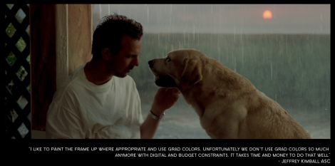 I like to paint the frame up where appropriate and use grad colors. Unfortunately we don’t use grad colours so much anymore with digital and budget constraints. It takes time and money to do that well.
– Jeffrey Kimball ASC
On Color
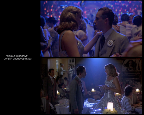
– Jordan Cronenweth ASC
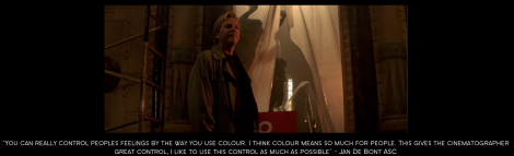 You can really control people’s feeling by the way you use colour. I think colour means so much for people. This gives the cinematographer great control. I like to use this control as much as possible.
– Jan De Bont ASC
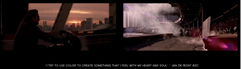 I try to use colour to create something that I feel with my heart and soul.
– Jan De Bont ASC
 I used color in places that wouldn’t have them but could have had them.
– Jan De Bont ASC
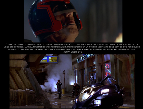 I don’t like to go too blue at night. I let it go about half blue – I don’t particularly like the blue colour of HMI’s so instead of using one of those, I use a tungsten source for moonlight, and then warm up my interior lights with some sort of CTO for colour contrast. I then have the lab print the scene for normal skin tones which makes my tungsten light source slightly cold.
– Adrian Biddle ASC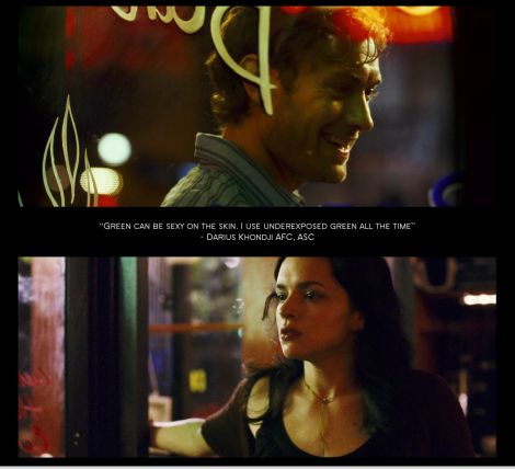 Green can be sexy on the skin. I use underexposed green all the time.
Green can be sexy on the skin. I use underexposed green all the time.
– Darius Khondji AFC, ASC
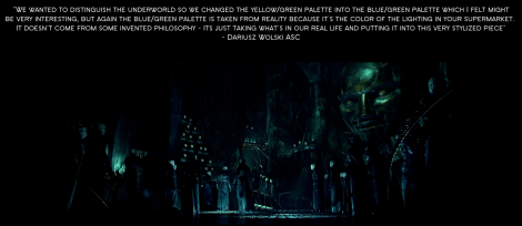 We wanted to distinguish the Underworld so we changed the yellow/green pallete into the blue/green pallete which I felt might be very interesting. But again the blue/green pallete is taken from reality because it’s the colour of the lighting in your supermarket. It doesn’t come from some invented philosophy – it’s just taking what’s in your real life and putting it into this very stylised piece.
– Dariusz Wolski ASC
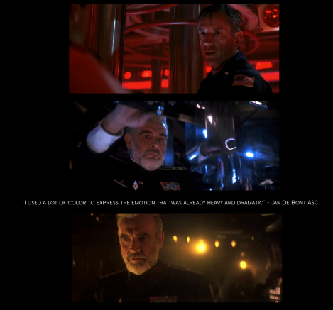 I used a lot of color to express the emotion that was already heavy and dramatic.
I used a lot of color to express the emotion that was already heavy and dramatic.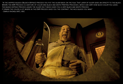 In the skip bleach bypass process you put the silver back on the film. That layer of silver gives an opacity to the black. Where the ENR process is a mixture of color and back and white printing processes which can vary how much color you leave. The bleach bypass process leaves the silver on it which gives you a very black and white process. It drains the color a lot, whereas the ENR processes gives you the contrast, the nice black you want.
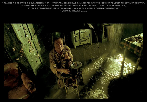 I flashed the negative in Delicatessen 1/8 or 1/4 with warm gel or blue gel according to the scene or to lower the level of contrast. Flashing the negative is a slow process and you have to want the effect of it. He can be seductive. If you do it too little, it doesn’t show and if you do it too much, it flattens the negative.
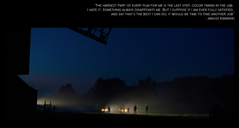 The hardest part of every film for me is the last step, color timing in the lab. I hate it. Something always disappoints me. But I suppose if I am ever fully satisfied, and say that’s the best I can do, it would be the time to find another job.
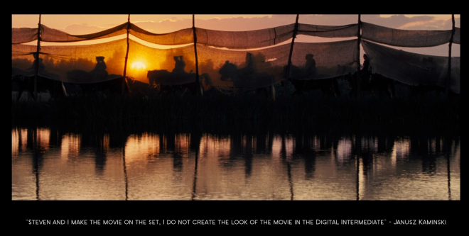 Steven and I make the movie on set, I do not create the look of the movie in the digital intermediate.
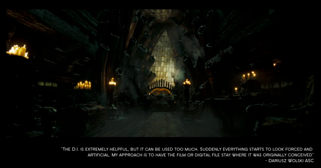 The DI is extremely helpful but it can be used too much. Suddenly everything starts to look forced and artificial. My approache is to have the film or digital file stay where it was originally conceived.
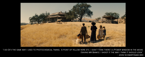
I do DI’s the same way I used to do photochemical timing: a point of yellow here etc. I don’t think there is a power window in the movie [Saving Mr Banks] I shot it the way I think it should look.
– John Shwartzman ASC
On Film and/or Digital
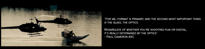 For me format is primary and then second most important thing is the glass, the optics. Regardless of whether you’re shooting film or digital… It’s really determined by the optics
– Paul Cameron ASC
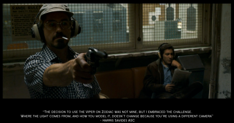 The decision to use the Viper on Zodiac was not mine, but I embraced the challenge. Where the light comes from, and how you model it, doesn’t change because you’re using a different camera.
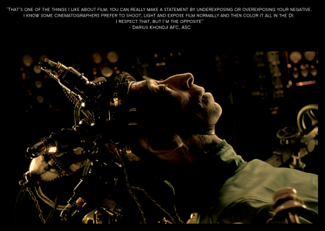 That’s one of the things I like about films. You can really make a statement by underexposing or overexposing your negative. I know some cinematographers prefer to shoot light and expose film normally and then color it all in the DI. I respect that. But I’m the opposite.
– Darius Khondji AFC, ASC
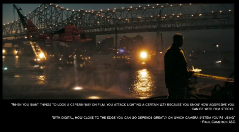 When you want things to look a certain way on film, you attack lighting a certain way because you know how aggressive you can be with film stocks. With digital, how close to the edge you can go depends greatly on which camera system you’re using.
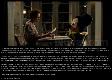 Film fails with elegance in overexposure, and digital does not. I’m not anti-digital – we did the Amazing Spiderman with digital cameras – but film allows me to shoot in a very organic and naturalistic way. I prefer to look through the eyepiece rather than at a TV set. The eyepiece shows me what I’m going to see, as opposed to a monitor, which is the REC.709 image.
A while back I shot some comparison test with every formats and types of camera, including three digital cameras, and showed it to a range of filmmaking professionals. We processed the film photochemically and we also scanned at 4K. Every person in the room said anamorphic looked the best. It wasn’t even close. I’m not talking about a little bit better – I’m talking better in every respect. The photochemical print made me realise why Christopher Nolan, Wally Pfizer (ASC, BSC) and Janusz Kaminsky don’t do a DI. I ran it for the studio without telling anybody what they were looking at. I told them to pick the one they liked the best, and in every single setup they picked the film. They didn’t know what they were looking at, but they knew there was something magical about it.
The image quality of a photochemical finish on film is still by far and away the gold standard. Nothing looks better. Until something comes along that is better I prefer to shoot film.
– John Shwartzman ASC
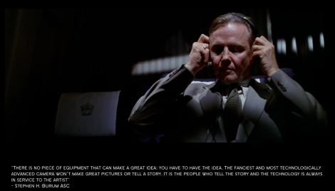
There is no piece of equipment that can make a great idea. You have to have the idea. The fanciest and most technologically advanced camera won’t make great pictures or tell a story. It’s the people who tell the story and the technology is always in service to the artist.
– Stephen H. Burum ASC


Yorumlar
Yorum Gönder