Filmde Renk Düzenleme ve Renklerin Devamlılığı
In this post we explore matching using primary color correction. When working with RAW footage, it is ideal to perform these tasks manipulating the RAW metadata controls at the debeyering stage rather than primaries on the ‘video’ image.
We are using the primary controls in DaVinci Resolve. These concepts and procedures can easily be translated to other applications.

John Brawley’s shots used in this post are available at the BlackMagic Forum (here). The original footage has been altered to introduce noticeable issues.

Match Exposure and Contrast
When matching exposures, we need to ensure that the same element under the same conditions appear to have the same hue, saturation and lightness from a shot to the next, paying particular attention to the point of interest within the frame, often the face of an actress or actor.
It is advised to start with controlling and monitoring the luma values, the Y channel. Luma allows to control the exposure maintaining the color balance intact.
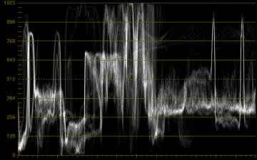
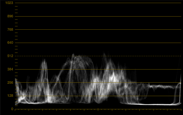
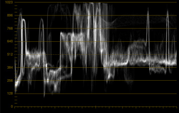
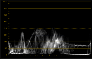
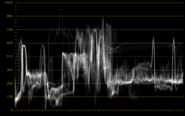
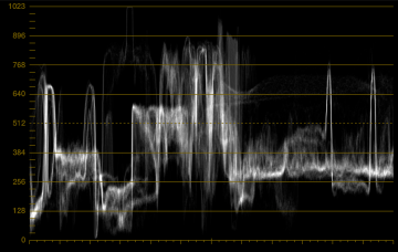
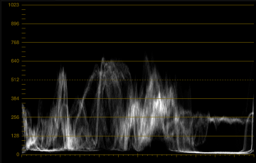
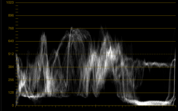
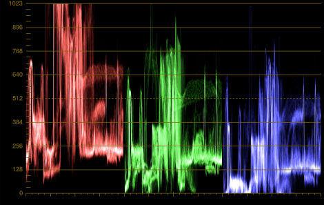
A waveform monitor displays the amplitude level along the vertical axis, with blacks at the bottom (0) and the whites (100) at the top. The horizontal axis of the waveform corresponds to the horizontal placement of the pixels. This provides a left to right representation of an image’s brightness, with shadows at the bottom and highlights at the top.
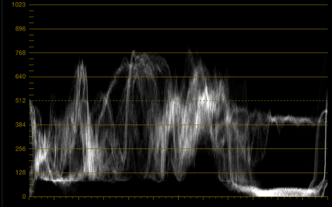
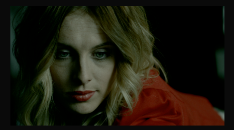
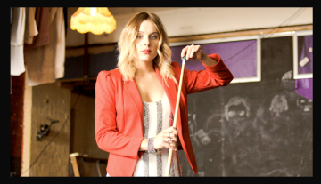
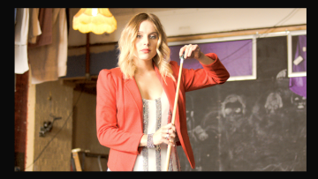
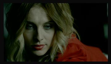
When looking at these two shots and their corresponding waveforms we can notice they have very different exposures.
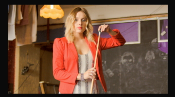
On Shot A, the values are spread over the full range, even beyond the maximum level, the shot is possibly overexposed.
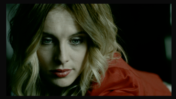
On Shot B, the values are crushed between 0 and 50% and the shot is possibly underexposed.

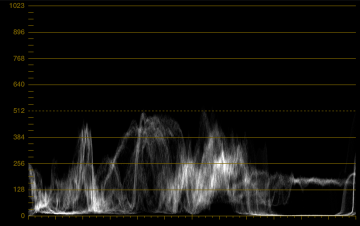
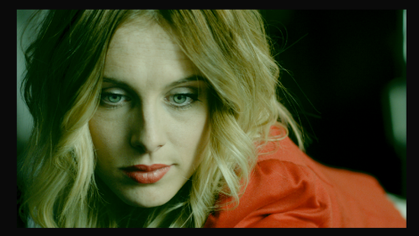
We really need to identify our matching elements: the red jacket, her face and her hair. It is quite difficult to identify mid-tones on a waveform monitor in the middle of all the other information, but we can sample the image to get detailed info on a few pixels.
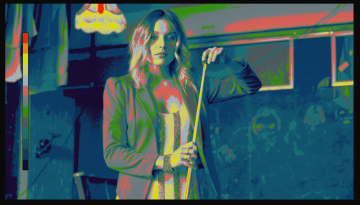
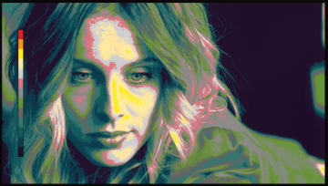
tomasz.cc provides an interesting plug in that maps the brightness values of your image to a set of colors (here). This can be a valuable tool when setting your exposure and checking the matching of your shots.
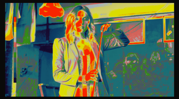
Here we can clearly see that the exposure of the face is different in the two shots and needs adjustment. Someone did not balance the camera properly (or someone intentionally butchered this shot in post).
What is the ‘right exposure’? I am tempted to answer: “whatever the cinematographer set it for”. On many digital production you will receive shots metadata, possibly CDL’s (Color Decision Lists) and shots of reference targets from the set. These will inform you on the intent of the camera department regarding exposure and all other aspects of the shot.
If the exposure has to be corrected on some shots, you will have other shots within the scene to use as references. However, if somewhere along the chain something really wrong happened, or simply information was not passed onto you, you will have to use your own judgment to set a proper exposure.
The Ansel Adams Zone System offers an ideal as to what constitute good exposure. The image is divided in zones of brightness and ideal values of ‘memory colors’
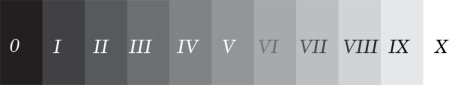
For more information on the Zone System head over to clickitupanotch.com to check Zone System: The Basic by Trisha Hughes. See an excerpt below.
The Zones Defined
There are 11 “zones” of print. When metering, you’ll basically only use the 5 middle zones.
Zone 0 (0)– Black, no detail or texture
Zone I (1)– A slight step above pure black, again no texture or tonality.
Zone II (2)– Black but with first hint of texture.
Zone III (3)– Very dark tones that shows visible texture. Includes black, dark brown, navy, and includes detail. Foliage in the shade, dark wet wood, dark rocks in rivers/streams, dark fur in animals. Will read -2 on in-camera meter.
Zone IV (4)– Royal blue, purple, burgundy, dark red, and dark green. Evergreen trees, deep blue sky, fairly dark skin, dark stone, landscape shadow. Will read -1 on in-camera meter.
Zone V (5)-This is middle gray. 18% Gray card, average blue sky medium red, green, blue (think primary colors), dark orange, most grass, medium skin tones. Reads “0” on in camera meter.
Zone VI (6)– Average Caucasian skin tone, most pastel colors, fog, light blue sky. Will read +1 on in-camera meter.
Zone VII (7)– White with detail, white fur, white clouds, white sand, snow, whites in running water. Will read +2 on in-camera meter.
Zone VIII (8)– Whites with little detail, bright white snow in bright sun, highlights on Caucasian skin.
Zone IV (9)– White without texture, approaching pure white.
Zone X (10)– Pure white. No detail or texture.
These zones suggest ideals values for a good exposure. They do not take into consideration the overexposure or underexposure the DP might have intentionally set for parts of the shot.
We intend to use the talent’s face to match exposures. A general understanding of the different areas of shadow and lights will be of great help in guiding our steps.
From the Arri Lighting Handbook (here)
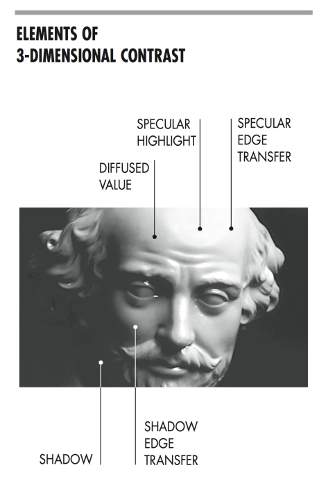
THEORY OF 3-DIMENSIONAL CONTRAST
The Theory States: A single light source directed at a single object of a single density normally will produce three separate densities: the diffused value, the specular highlight and the shadow. The presence of these three densities can reveal shape, form, texture, density and depth.
DIFFUSED VALUE The true tone or natural brightness of an object. Accurate reproduction of the diffused value often determines a proper exposure. The diffused is a constant, objective value, while the shadow and specular are variable and subjective.
SPECULAR HIGHLIGHT The mirrored image of a light source on an object. The specular highlight is always brighter than the true tone of the object. A properly placed specular highlight will reveal shape and texture on an object.
SHADOW The area on a 3-D object that receives no illumination from the primary light source. The shadow is always lower in brightness than the true tone of the object. A properly placed shadow will reveal shape and form on an object.
SHADOW EDGE TRANSFER The area of transition between the diffused value and the shadow. It is the primary indicator to determine the quality of light produced, i.e. hard or soft light.
SPECULAR EDGE TRANSFER The area of transition between the diffused value and the specular highlight. The specular edge transfer usually defines the surface texture of an object. The smoother the surface, the harder the edge transfer.
Back to our corrections.
First, we adjust the lift, which mainly controls the shadows. Let’s bring the shadows up to get a glimpse at the details (if they were not crushed in production).
Then, let’s bring the darkest pixel within the shadows to 0. If we push values below 0 we are crushing detail. Crushing the blacks is a valid creative manipulation. However, it should not be applied at this stage of the color correction process. It is best explored with curves at a later stage.
Most shots will have some reference of black in them, if not use your judgement. (Remember, if you really, really, but I mean really insist in having milky blacks you can easily raise your shadow on all the shots within the scene at a later stage.)
Then, we adjust the gain, which mainly controls the highlights. Again, let us bring the gain down to see the full highlight information and its detail (if it has not been clipped during production).
On shot A, we have an easy reference point, a light source. The light bulb is clipped and should be placed at the maximum white value. If we were to bring it down under the maximum value, it would start to look like a grey block of pixels.
On shot B, we do not have any elements that should be brought up to 100%. We need to judge the image, in itself or in comparison to another shot, and adjust the gain to the right exposure.
The last step is to adjust your gamma, or mid-tones. Again, you need to use your judgment to adjust the shot as needed. Have we lost contrast in the shadows, or have we lost contrast in the highlights? Are the points of interest at the same levels?
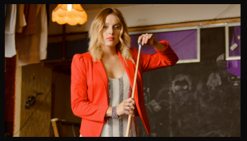
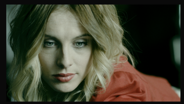
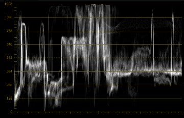
When comparing the waveform monitors, the values are now spread over similar ranges. The most important aspects of this match are her face and the red jacket. Keep in mind tat the white stripes on her shirt are only visible in shot A.
We are not stylising the shot yet. We are simply attempting to match all shots within a scene, to later work on an even surface while exploring/pasting looks.
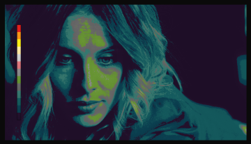
Let’s check it with the false colors plugin.
Good enough, let’s move on.
Matching Hue and Saturation
The vectorscope shows the overall distribution of colours against a circular scale.
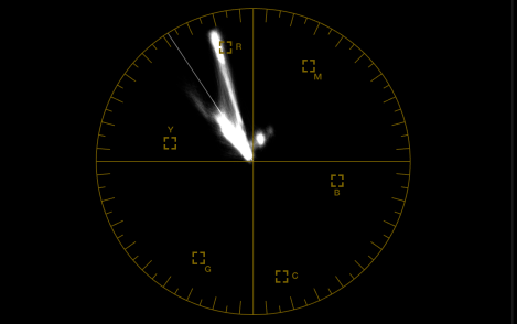
The angle around the scale represents the hues of the various pixels. The distance from the centre of the scale represents the saturation. Zero saturation at the centre maximum saturation at the edge. The letters (R for Red, MG for Magenta, B for Blue, CY for Cyan, G for Green and YL for Yellow) are there to reference the various angles and legal levels. Are used to check the accuracy of a captured video signal, using the colour bars recorded at the head of a video. The angles should fall precisely at the centre of the targets.
Looking at the Vectorscope. We can notice tint by checking whether the plot is centred or not. Most shots will have a black or a white reference within them. These unsaturated pixels should fall right in the middle of the scope. If they appear off-centre, we can fix their balance using the offset controls.
The RGB Parade monitor is divided horizontally into 3 separate sections which provide a waveform monitor for each color channel (red, green and blue). With this we can verify that the three channels are balanced, using pure blacks, greys and whites as references. An unsaturated element should show roughly the same values on all three channels.
Let’s verify the color balance and just the saturation. We will set the saturation paying attention to the spread of the plot on the vectorscope. We want the red jacket to be positioned in roughly the same position.
Shot A’s plot is offset towards orange. We will need to dial the offset red down and push the offset blue up to fix this (adding blue = removing yellow). This is confirmed by the Parade, where we can see that the green channel appears to be fine, but the red channel is set too high and the blue channel too low. We will use her skin tone and the red jacket as references. What are the values on the parade? Where are the skin tones and the red jacket moving to not the vectorscope?


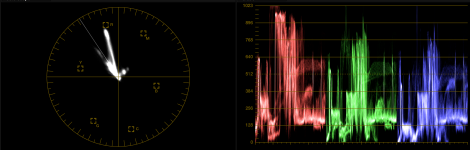

Shot B’s plot is offset towards green. We will need to offset the green channel down and bring red and blue back up. Again, we use the red and the skin tone as reference for the match.


You might need to adjust the lift, gain and gamma of your individual channels. Various lenses, sensors and encoding procedure might introduce non-linear ‘distortion’ into your color information. Again, start with the lift, then the gain and finally the gamma. Remember, that if a single element appears to be problematic you can use secondaries in the next node to balance things out.
The most important tool in checking your mach is your eyes. You can switch from one shot to the next and verify if they appear to ‘jump’ in exposure or color balance. Or you might want to use split screen reference wipes to verify your shots. Whatever works for you.
I believe you need to match your shots twice. Once at the begging of the grade when you create an even canvas. Another time, at the of the creative process, after relighting, applying color schemes, defining the look and maybe adding LUTs, you will go through this process of matching again, verifying that your exposure and color balance do not create an unwanted jarring sensation for the audience, an attack to the bubble that transports them into another world.
Fancy a bit of a game? Try http://kolor.moro.es and see how well you can match those colors!


Yorumlar
Yorum Gönder