Renk Düzenleme: Soğuk mu, Sıcak mı, Yüksek Kontrast mı?
Colorists tend to approach the task of correction and grading through multiple passes. When mixing light, I start with the more surgical aspects of the correction before going through a series of artistic manipulations (color equalisation, relighting, isolations, looks,…) Every project brings a new set of challenges and a new set of directions and possibilities. I enjoy the discovery stage the most. After understanding the emotions, story and motivations, I select a few keys shots from the various scenes and play; build a few versions before committing to a look. (Even when given a clear artistic direction, I like to offer alternatives I think might be worth exploring)
The few example below are built using a frame from Interdiction, a short film produced by Erimus Productions (also see their Facebook and Twitter feeds) (these ex-students will quickly surpass the ‘old’ master)

In the simplest interpretation, the grade will either be warm or cold, high contrast or low contrast. Pushed to the extremes, we could represent them as follow.

All we have done so far is to push the grade in a 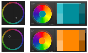 single direction (In Resolve, Primary Grade Offset Trackball), experimented with contrast and desaturated the shadows (using the Lum vs Sat curve) We are painting the frame with a single Hue.
 single direction (In Resolve, Primary Grade Offset Trackball), experimented with contrast and desaturated the shadows (using the Lum vs Sat curve) We are painting the frame with a single Hue.
(Why am I using teal and orange as the main hues for these examples? See it here!)
I do not mind extremes during the exploration. I am a big fan of the ‘mix function’ most grading applications and filters provide. It allows to clearly see/show the direction before ‘tuning’ the effect to the ‘right’ level. (In Resolve, you can find a similar tool using the Node Key Output Gain control.) With some adjustments, even a simple one-hue correction can provide something interesting.
 Here is how this Output Gain control assists my exploration of contrast.
Online Color Scheme Designers can suggest a few approaches, or looks, you can experiment with. The examples in this post are taken from the legacy interactive Color Scheme Designer 3, now updated to Paletton.com.
Analog schemes are built with hues of similar temperatures. Shadows, Mids and Highlights are pushed towards slightly different hues in a similar range. This result in a low “colour contrast” but with a greater variety of shades.
 The idea of ‘contrast’ is most commonly associated with the difference of luminosity between the bright and dark areas of a frame. Color contrast, on the other hand, is achieved by pushing various aspects of the image towards contrasting hues (Teal and Orange being the most popular example)
In the examples below, Gamma is ‘pushed’ in one direction, while Lift and Gain are pushed towards the opposite Hue.
 The colour contrast can be “pushed further” using the Triad Color Scheme. With Triad, shadows, mids and highlights are pushed in three different directions (for example, orange, green and purple.)
 The few schemes above simply provide a starting point, a few ideas. Of course, we could paint the frame more precisely (using Log grading or isolations, for example). However, looks do not always have to be built with complicated sequences of nodes and blending modes. A simple 3-wheel grade already gives room for a wide array of possibilities and does not require the large amount of time lower budget projects cannot afford.
If you’d like to play with colors, but with some guidance from a master. I suggest you try http://www.dalegrahncolor.com. Dale Grahn’s iPad application is an excellent example of the power of 3-way color correction. Can you recreate his effective looks with simplicity?
Color correction is the art of manipulating emotions.
Do you really need a large quantity of layers, nodes or filters when a judicious and creative balance of your image can enhance your images, stories and emotions as effectively?


Yorumlar
Yorum Gönder