Renk Paleti ve Filmde Yarattığı Psikolojik Efektler
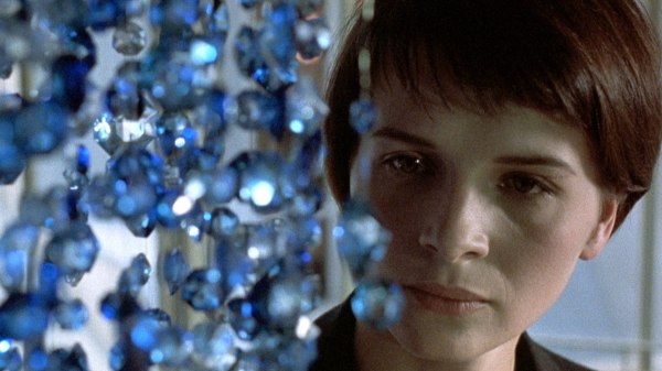
Not all colors are born equal. They affect us differently. Our feelings, mood and physical responses will likely vary when subjected to different wavelength of electrodynamics radiations, different shades of colorful lights. With hot colors, (for example red) we suddenly have tendencies to take more risks as our blood pressure and heart beat rise (ever wondered why casinos tend to have warm colors all around you?) Cold colors, on the other hand, have a tendency to calm and relax us as our blood pressure drops making some of you feel colder physically. More and more the use of ‘colors’ is being considered, researched and exploited in a variety of fields, filmmaking included.
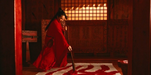
When considering colorful light as a way to manipulate mental and physical conditions of a person you could be tempted to call me a ‘hippy’. In Seeing red? The mind-bending power of colour, Tom Chivers writes: colours affect our mood – red makes us angry, or sexually receptive; blue soothes us, or saddens us; that sort of thing – seems vaguely hippyish. Alternative medicine types push “chromotherapy”, treating unwellness with colour; an odd amalgam of Victorian pseudoscience and cod-eastern mysticism. But now, the body of scientific research into colour is growing. And it all points to one thing: our perception of colour really does affect our minds, and our bodies. In fact, if I were to place you in a room with only red or blue walls the effect on your body and mind would be quite easy to measure. Some movies contains sequences that rely on saturating the frame with a dominant color leaving you exposed for extended duration of time to the effect of a single hue.
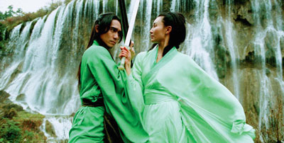
However, colors also take a different meaning and effect depending on the context. “red can be friendly when it’s associated with a ketchup bottle and baleful when associated with blood.” Not only our ‘detection’ of a shade of color can be tricked by its illumination and its environment, our understanding of colors is “relative, historical and empirical”. It varies from culture to culture and person to person and cannot be narrowed down to a series of physical reactions. Western and Eastern traditions differ on the meaning of certain colors. Even within western culture, different part of Europe regard warm and cold colors differently. For example, “Directors from northern Europe feel that cold colours are pleasant and warm colours are aggressive and disturbing.” (David Mullen, ASC.) Southern Directors might use warm colors associated with summerly sunlight to evoke happiness and the cold winterly colors of an overcast day with sadness.
From an evolutionary stand point, we seem to have developed color vision to assist our brains with contrast detection. It gives us a better chance to detect our preys (and our predators) within our surroundings. We are not seeing the world as it is but as it was useful for us to see it. The now infamously popular teal and orange look serves as an evidence of the power of separation contrasting colors can have. Furthermore, the warm and cold contrast seems to bring an extra dimension to the picture. The warm colors come forward and the cool colors retreat.
 This effect was first mentioned by Goethe in his Theory of Colors where he recognised blue as a receding color and yellow/red as a protruding color. This phenomenon is now referred to as chromostereopsis.
 Furthermore, the warm and cold contrast seems to bring an extra dimension to the picture. The warm colors come forward and the cool colors retreat.
 This effect was first mentioned by Goethe in his Theory of Colors where he recognised blue as a receding color and yellow/red as a protruding color. This phenomenon is now referred to as chromostereopsis.
Goethe
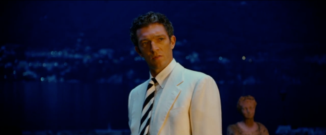
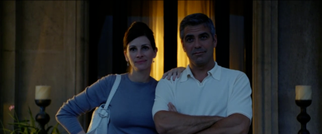
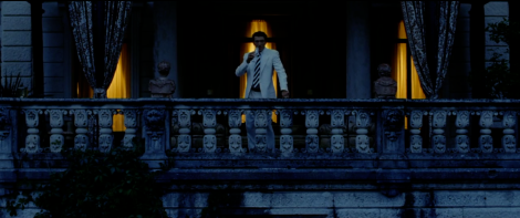
Let us look at a few shots from Ocean’s Twelve (2004).
Vincent Cassel’s character’s arrogance is emphasised by washing him in warm light while placing him in front of a blue background. His arrogance pushes him out of the shadow while he reveals the brilliance of his plan.
On the other hand Julia Robert and George Clooney are predominantly blue (lighting and wardrobe) in front of an orange background. They are patiently waiting in the shadows. Cassel receives the same treatment once his arrogance is disintegrated after realising he had been deceived.
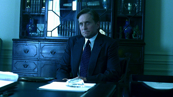
Oh, hello Mr Frank Underwood. What are you scheming in the shadows?
In the end, the ‘color’ we will see depend on the kind of material we are looking at, the quality of the light it is reflecting and the nature of the medium through which we are watching. In the world of film that is your Production Designer, your Director of Photography and your Colorist (and their respective teams). They will bring their individual sensibilities and unique experience and relationship with colors to the project and as a director it would be your job to guide and facilitate the dialogue.



Yorumlar
Yorum Gönder